InfoNgen is an enterprise-focused text analytics and sentiment research platform. It helps find actionable insights in web articles, social networks, and regulatory documents and assists organizations in making better-informed decisions.
How It Works
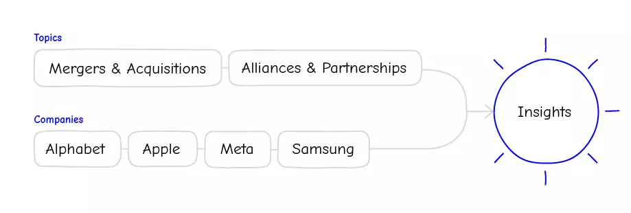
As the primary instrument, InfoNgen (‘Info-Engine’) utilizes tags, or smart keywords—pre-defined search queries with complex logic under the hood.
Let's assume, that you need to stay informed about acquisitions made by your company's competitors. For that, you can set up a search query with smart keywords such as Alliances & Partnerships, Mergers & Acquisitions, and companies of interest. The result will be a curated list of articles that you can research or assemble into an email newsletter for your peers.
In another example, as a market researcher, you can monitor for mentions of your company on social networks. With the sentiment analysis feature, you can track positive or negative things people say about your recent product launch. You can also observe how the sentiment changes over time with detailed analytics.
Where I Begin
There’s only one thing that designers love doing more than designing: redesigning. So my team and I had an opportunity to do just that.
Through the 10-year life of InfoNgen, it became outdated by modern standards. As a result, the experience of using the product got complex—to the point where you needed to call customer support for simple tasks. In addition, scaling the product and adding functionality got challenging.
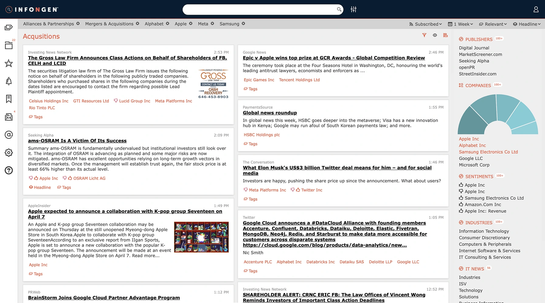
Old version of InfoNgen
My Role
I joined InfoNgen as a design lead. My team comprised (cue Avengers theme song) three designers focused on planning, research, and other UX tasks and two designers with visual design skillset. In a lean group like that (just enough for two pizzas), I was wearing many hats:
Ran user research and usability testing sessions
Collaborated with the product management, executives, and the development team
Generated solutions and defined design style
Coordinated work of my teammates (who participated in the above activities as well)
As a leader, I often needed to point at a whiteboard
Product Goals
At first, I needed to define the product goals. In collaboration with the product leads, we established the following:
Reduce existing issues
Reduce existing issuesWe will ask people to complete typical tasks in the new system and observe if any known problems persist
Modernize experience
Modernize experienceWe will redesign the product by modern standards and trends in aesthetics and accessibility
Keep existing customers happy
Keep existing customers happyWe will ask people questions about the new product and compare the results to the old version
Build a foundation for future growth
Build a foundation for future growthWe will create a design system and use other best practices for scalable products
While these goals may seem broad, this approach helped convey a more clear direction to get started.
User Research
Talking to customers is one of the most critical activities in a company's life. Because often, one's assumptions about the audience vary from the real-world situation. And they may end up spending a ton of time and effort to make a solution that doesn't solve real problems
I cannot set up or tune my search. I need to talk to customer support each time— Alexey, used InfoNgen daily for four years
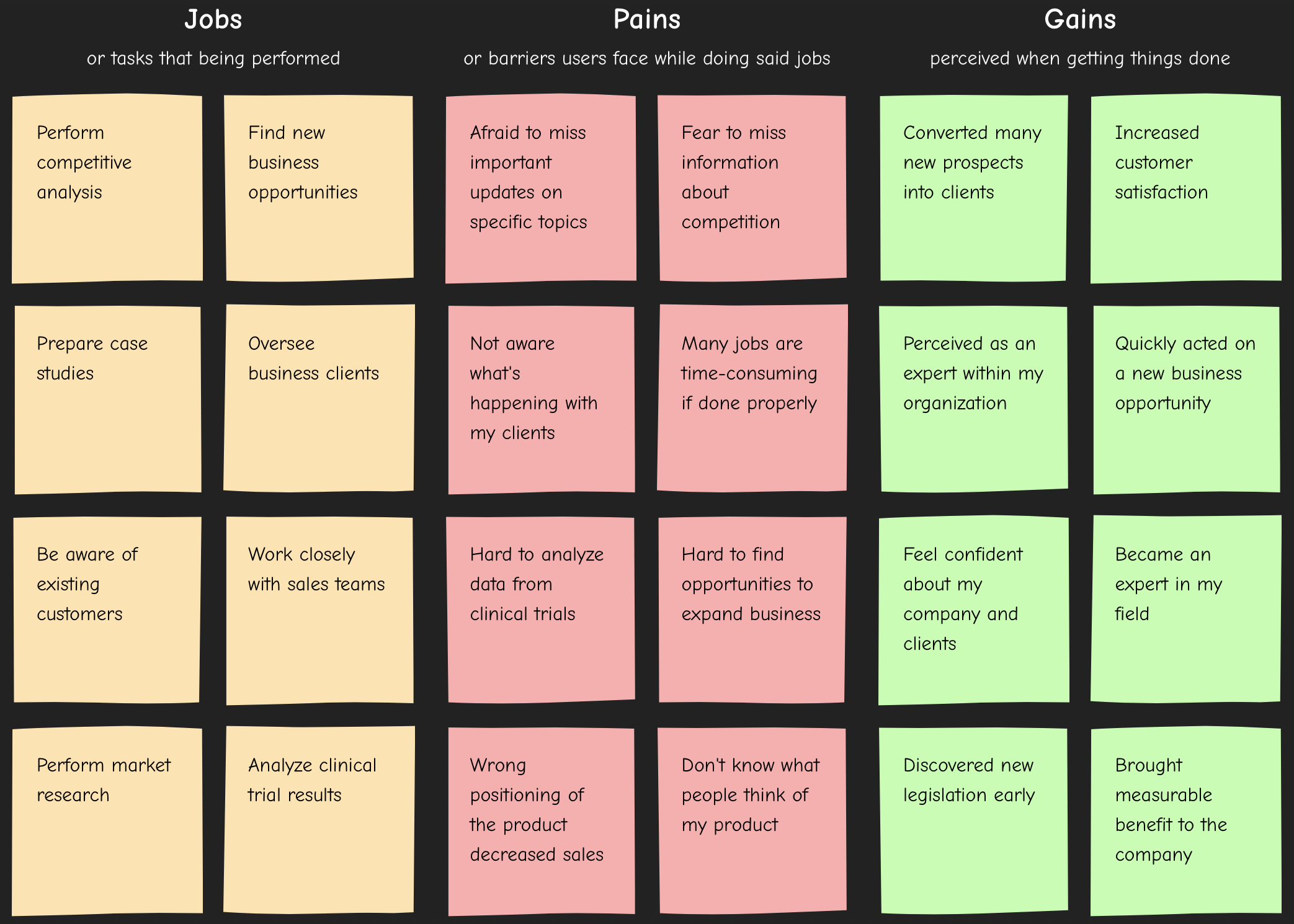
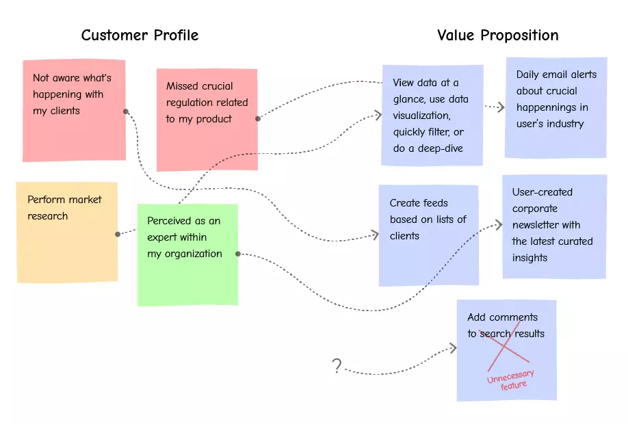
Before the research, I collaborated with the product management and the client support team—they already knew something about our audience. We created profiles of typical clients (also known as 'personas'). For this purpose, I utilized the Value Proposition Canvas methodology. It suggests describing customers based on three criteria:
Jobs
or tasks that being performed
Perform competitive analysis
Find new business opportunities
Prepare case studies
Oversee business clients
Be aware of existing customers
Work closely with sales teams
Perform market research
Analyze clinical trial results
Analyze internal work materials
Pains
or barriers customers face while doing said jobs
Afraid to miss important updates on specific topics
Fear to miss information about competition
Not aware what's happening with my clients
Many jobs are time-consuming if done properly
Hard to analyze data from clinical trials
Hard to find opportunities to expand business
Wrong positioning of the product decreased sales
Don't know what people think of my product
Overwhelmed with the amount of information
Gains
perceived when getting things done
Converted many new prospects into clients
Increased customer satisfaction
Perceived as an expert within my organization
Quickly acted on a new business opportunity
Feel confident about my company and clients
Became an expert in my field
Discovered new legislation early
Brought measurable benefit to the company
Know the latest market trends
Some of the characteristics we came up with (and later confirmed) during the research. All you need for this exercise is a few packs of sticky notes and a wall.
Having points like these helps a researcher focus and ask customers the right questions. I used this approach successfully many times. It allowed me to get a lot of actionable insights and have a more straightforward path to product-market fit. At the same time, it's easy to understand for people unfamiliar with product design processes.
Interview Process
To get as accurate insights as possible, I included people of various demographics, backgrounds, and levels of expertise. Overall, I talked with fifteen people from four different countries.
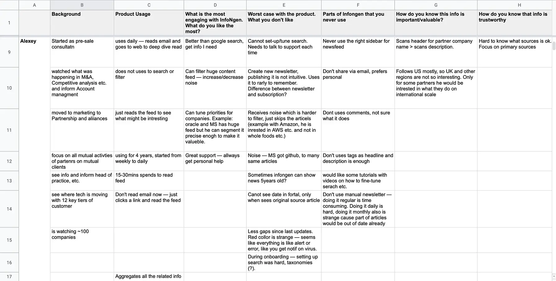
I put every bit of data, request, or observation into a single spreadsheet. This method helped me see everything at a glance and quickly notice emerging patterns.
And as it turned out, one of the product's primary features is also the one people struggle with the most.
Hardest to Use Aspects of the Product
I also confirmed many of the assumptions my team and I made. Still, we discovered a ton of new information and got a more accurate representation of the product audience.
Mapping & Prioritization
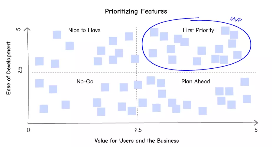
As I got verified insights about our clients, I mapped them to the product's existing features. This process effectively shows which functions were missing, unnecessary, or implemented poorly.
Then I ran an exercise with the product management and developers to prioritize the list of features. We used a variation of the Kano model. First, each function was rated based on its value for business and clients (from one to five) and ease of development. Then, we placed features on a graph divided into four sectors.
The First Priority sector was essentially a list of what we should develop from the beginning ('minimal viable product').
Solution
Defining Visual Style
I started with the primary brand components: orange color and Museo Sans typeface. In this product, people mostly read lengthy articles. So I introduced an additional font, Open Sans. Based on the quick tests I did with clients, it worked better in large paragraphs of text. Museo Sans took a role of an accent font, used for headlines and interactive components.
Some customers commented about an eye strain they were getting due to excessive use of the brand orange color. So that's why I added a new blue color. It would act as a highlight for interactive elements yet won't stand out as the orange one.
I also made a grid layout that focuses on the reading experience further. It leverages white space to draw attention to the content and lets easily differentiate sections on the screen
Primary Page
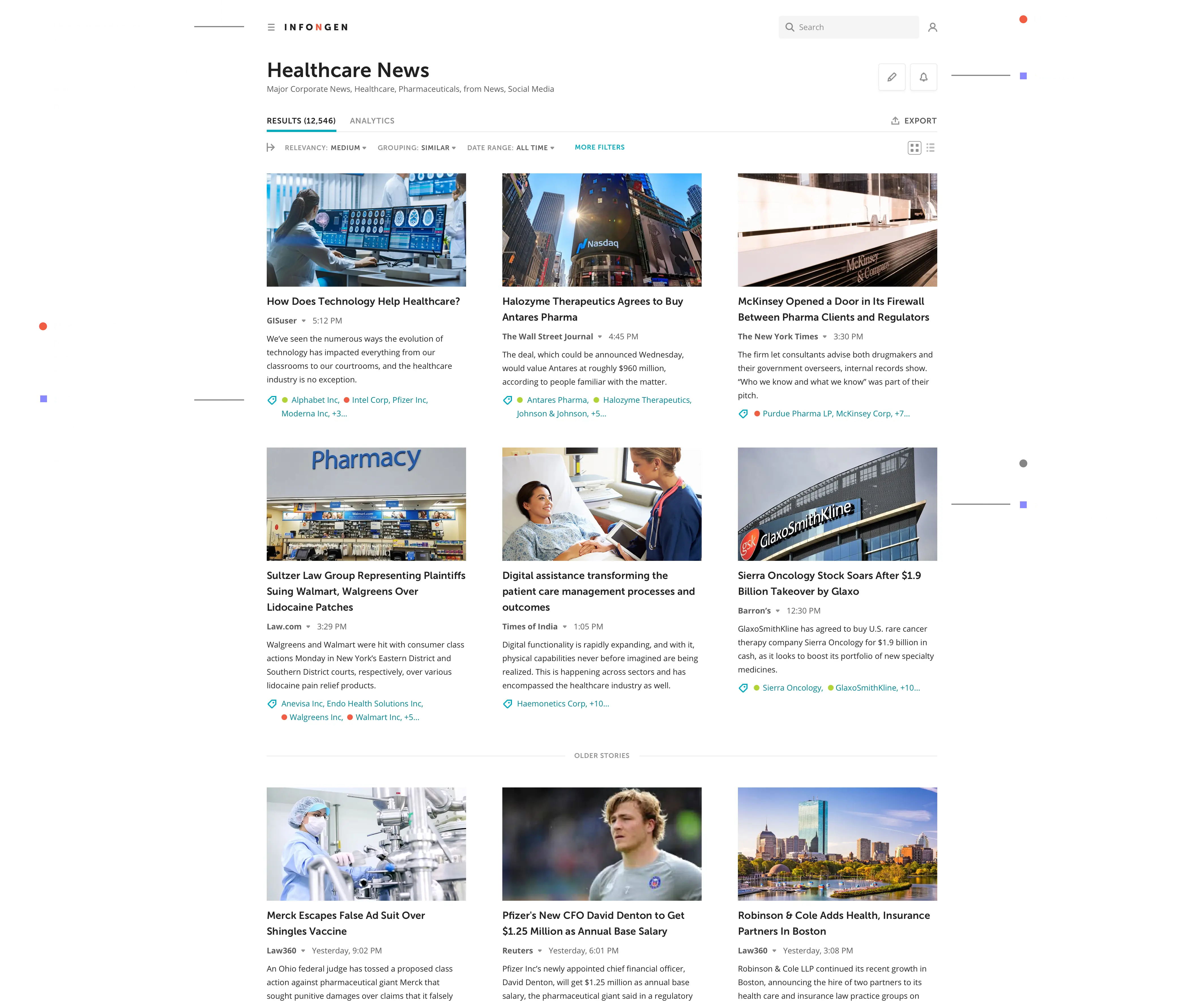
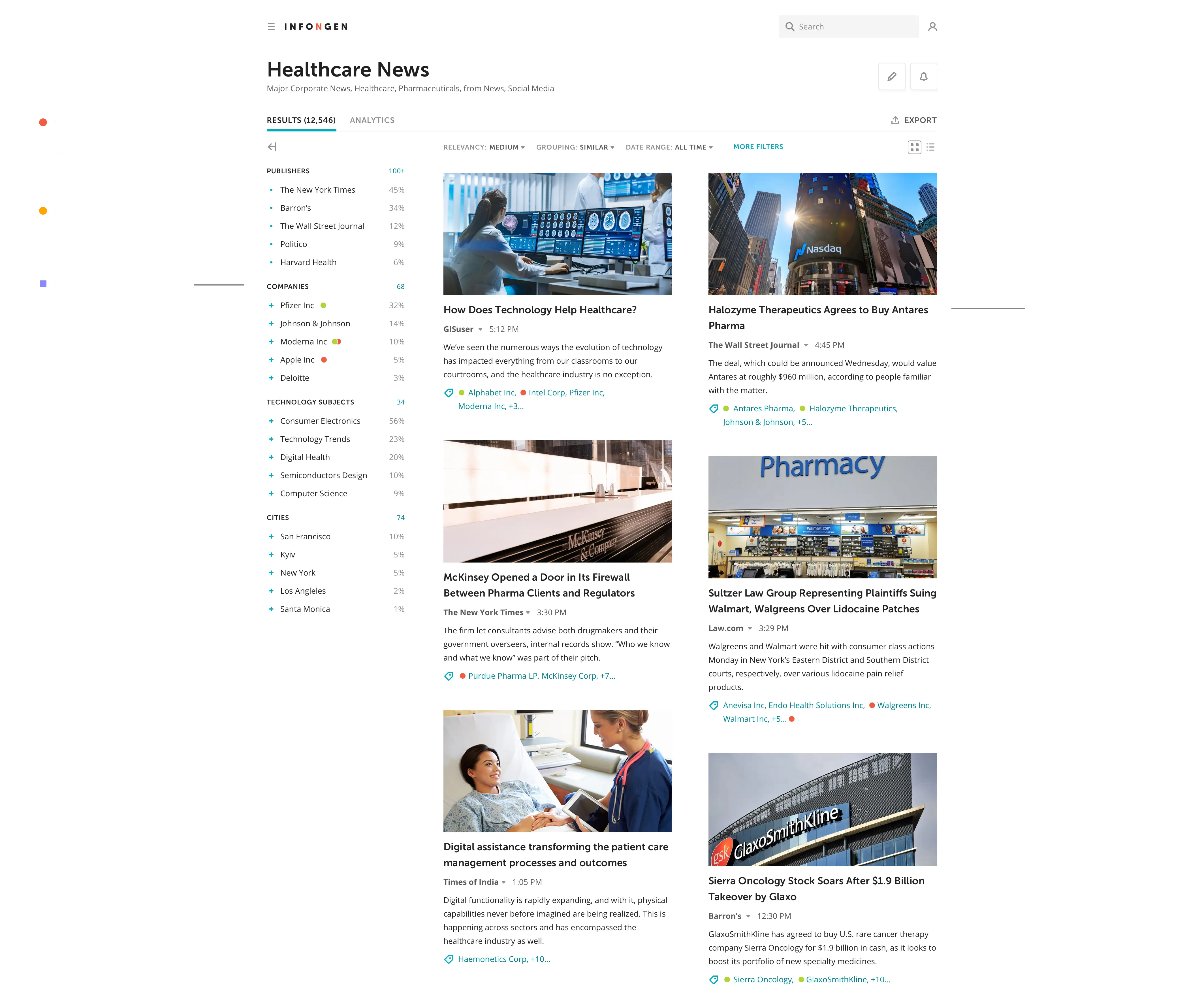
Search Results is the primary page of the product. People use it to look for insights. So I designed it to focus on reading while keeping secondary stuff out of the way.
Default
Filters
Setup
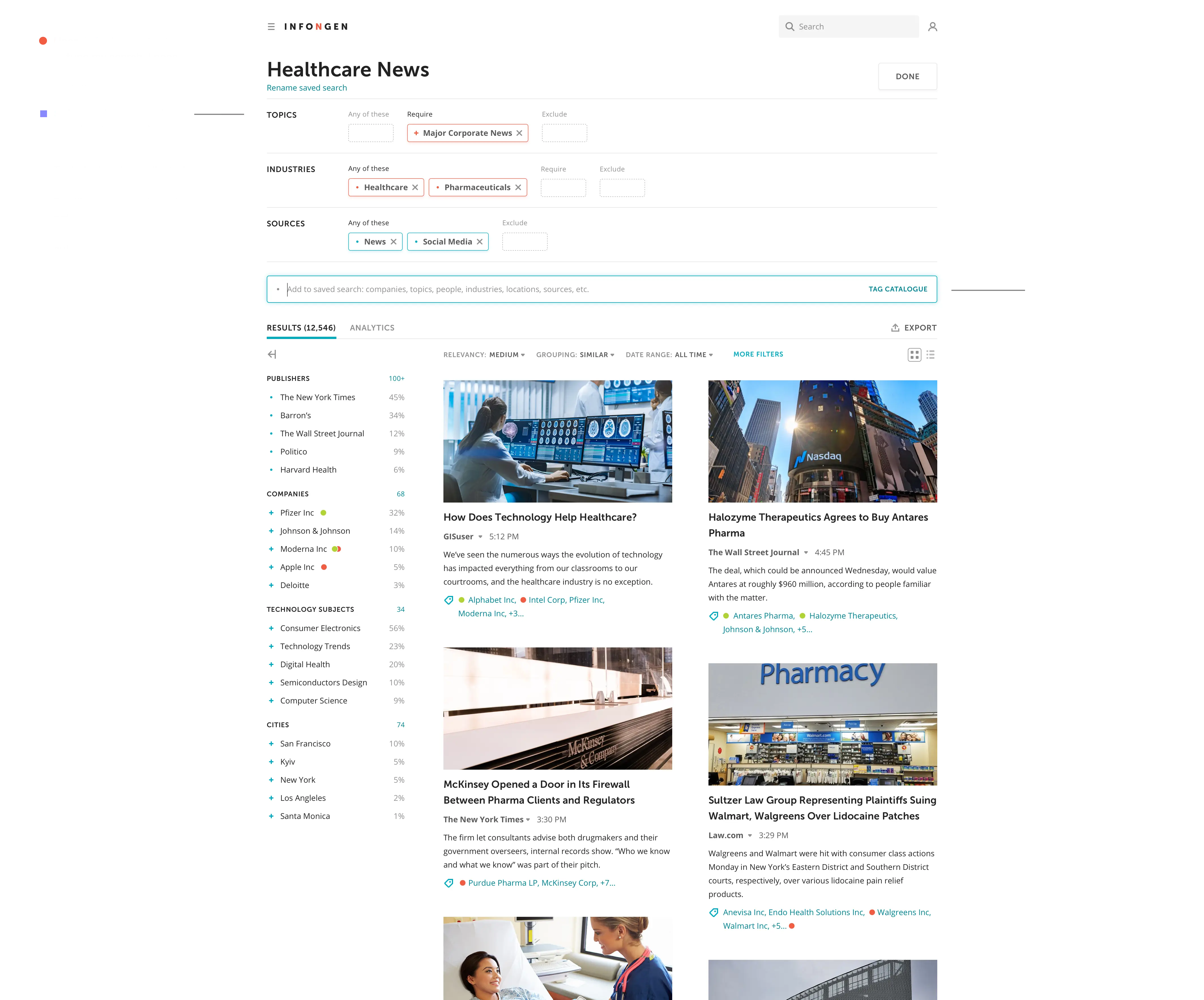
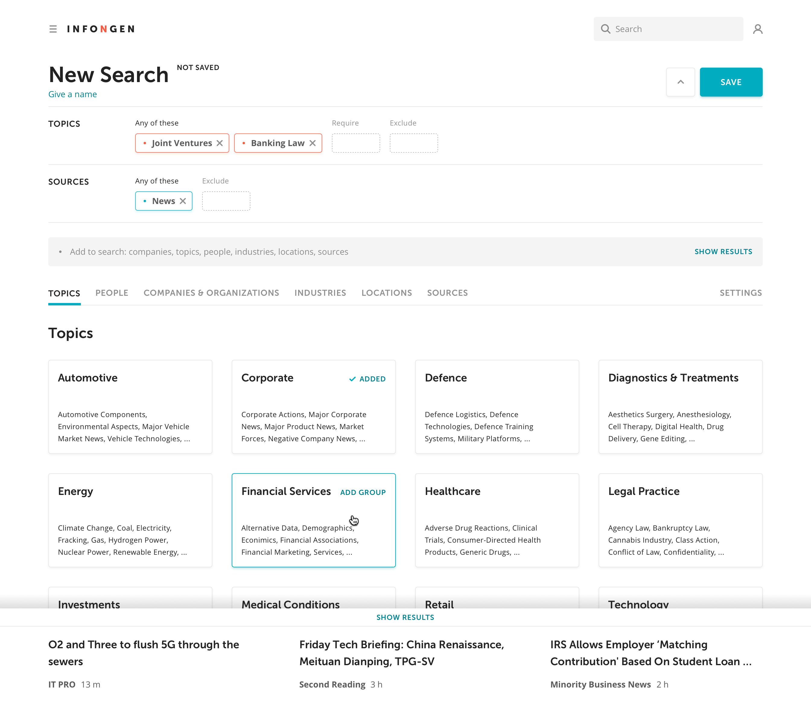
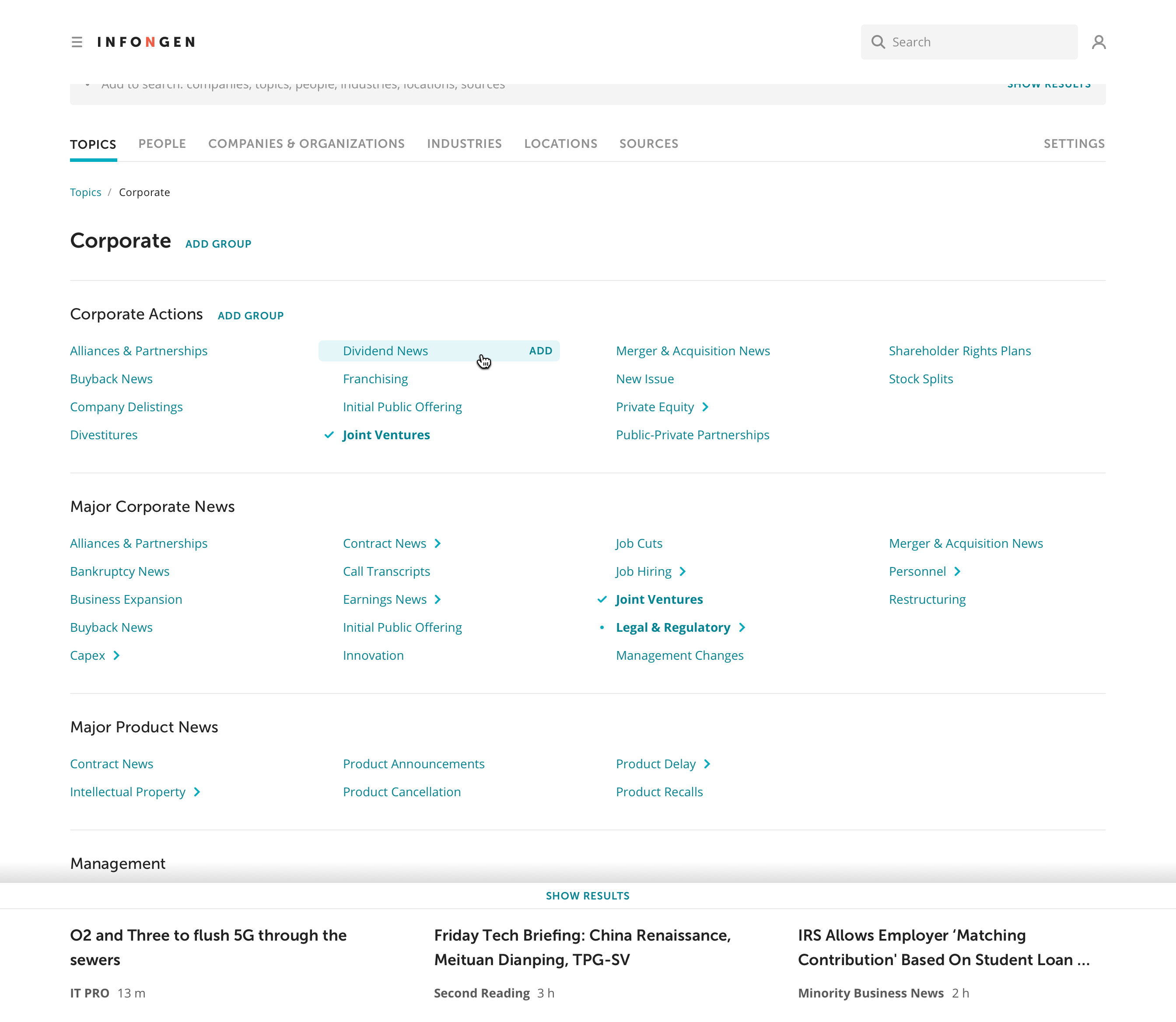
Search Setup
I redesigned the search setup process from the ground up. Typical components and patterns allow people to get familiarized with the setup process faster. Moreover, simple terms help them better understand the logic behind tag groups.
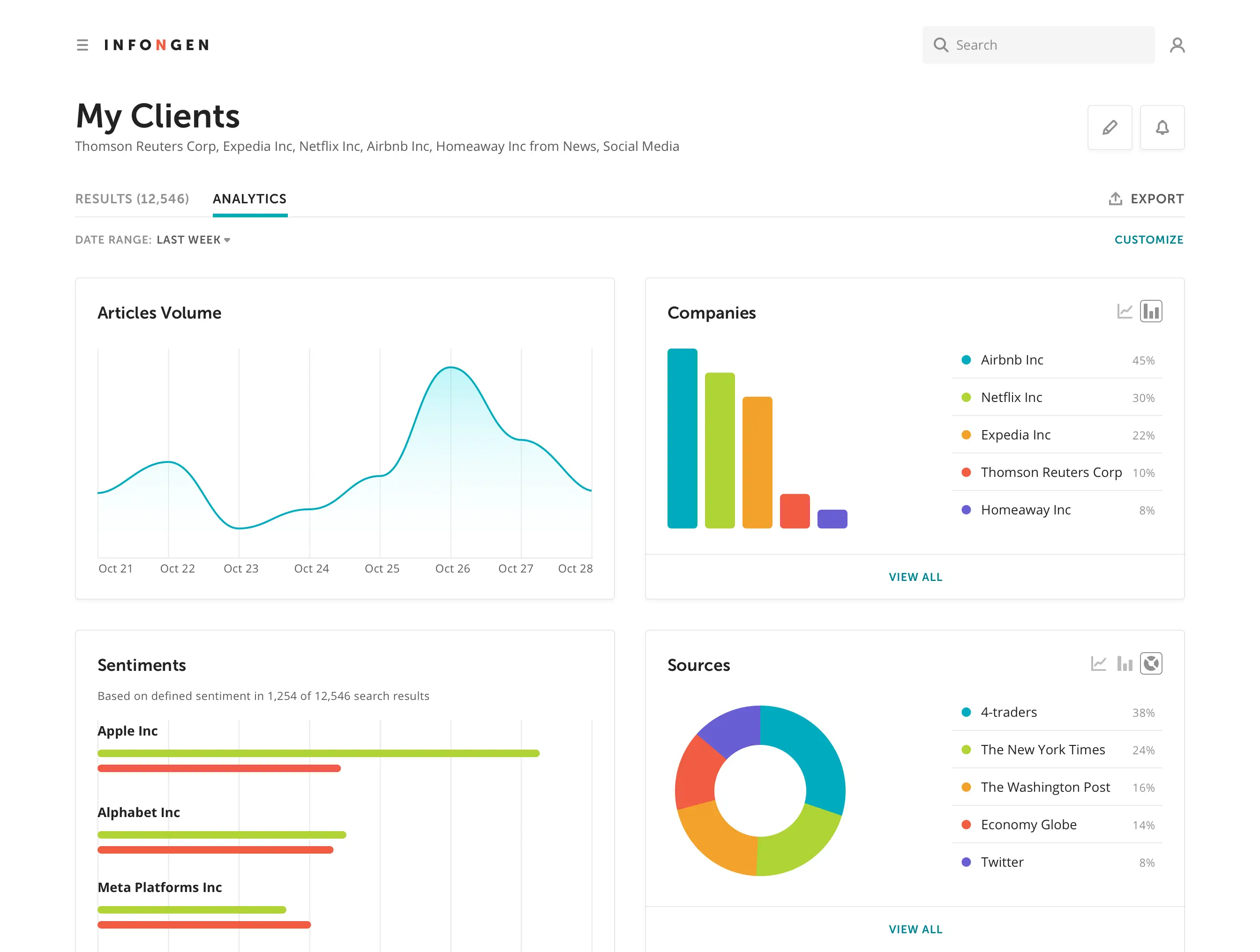
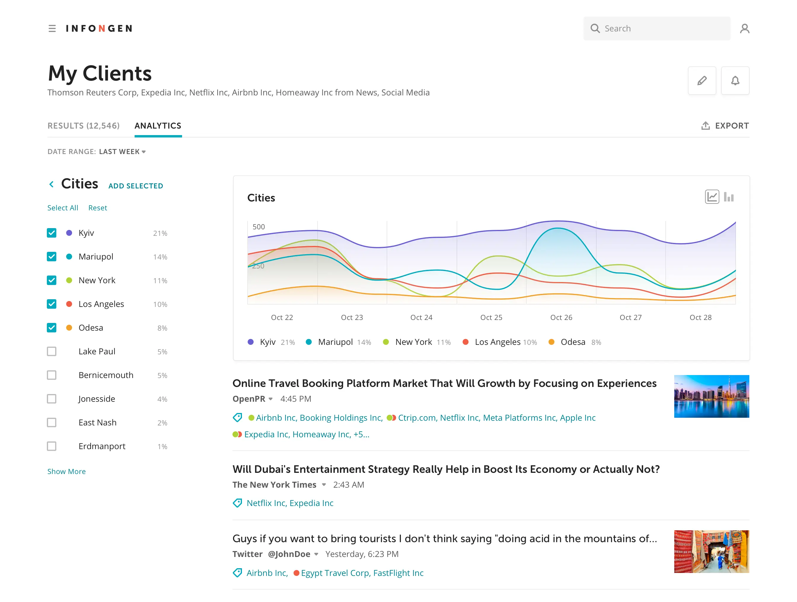
Analytics
Our audience uses the Analytics view to discover emerging trends and patterns in their search results. They can also utilize widgets to refine the noise in their feed even more.
Overview
Deep Dive
Navigation
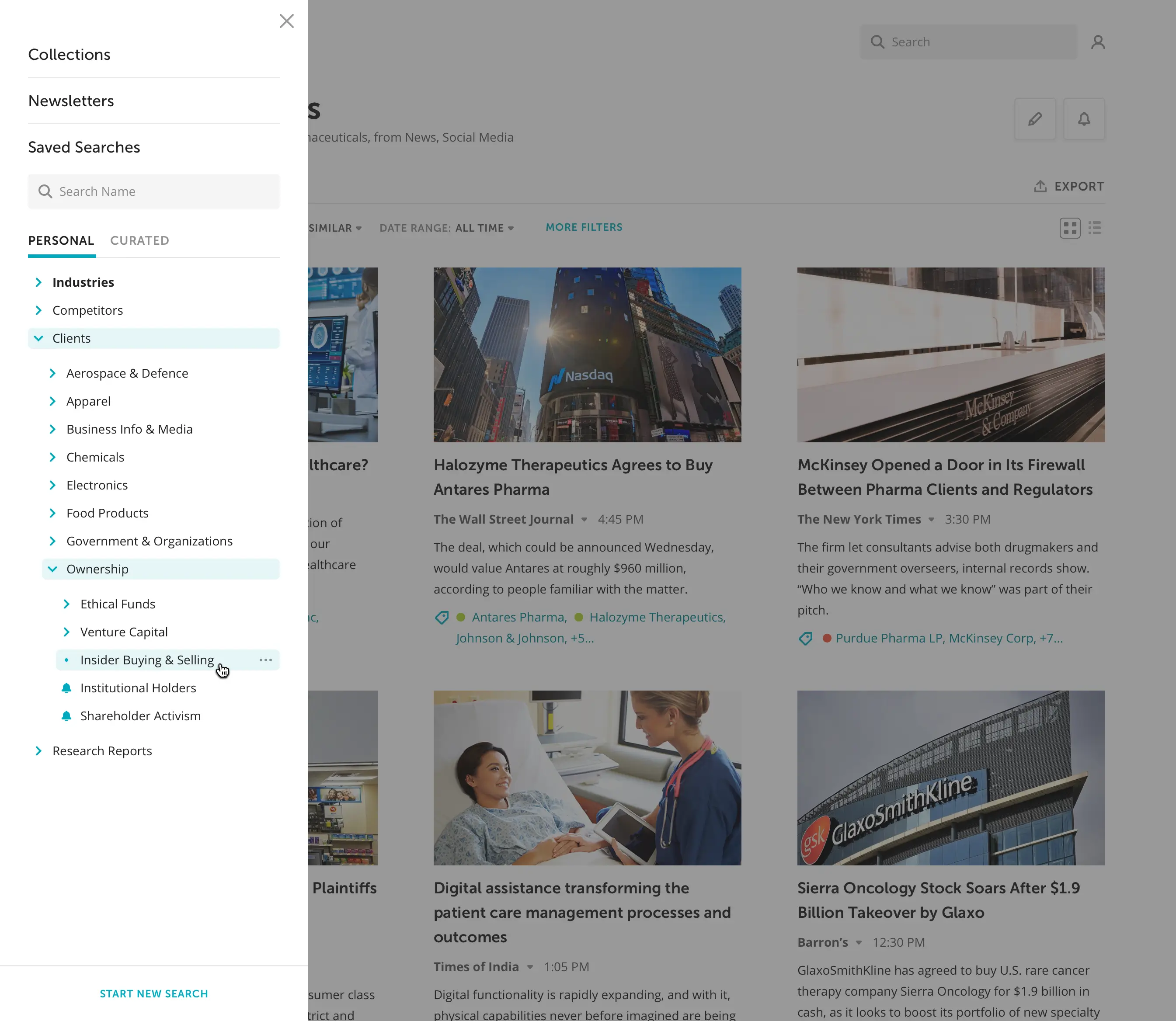
One of the more sophisticated parts of the product was navigating within Saved Searches and Tag Catalog. The challenge was to make it clear yet flexible for future expansion.
Main Nav
Tag Catalog
Tag Group
Some people have only a few items in their Saved Searches, while others have dozens. Each item group is clickable as well as individual items. Tag Catalog also features many categories and subcategories. A person can add any of them as a search query. My team and I brainstormed a solution that effectively covers all use cases.
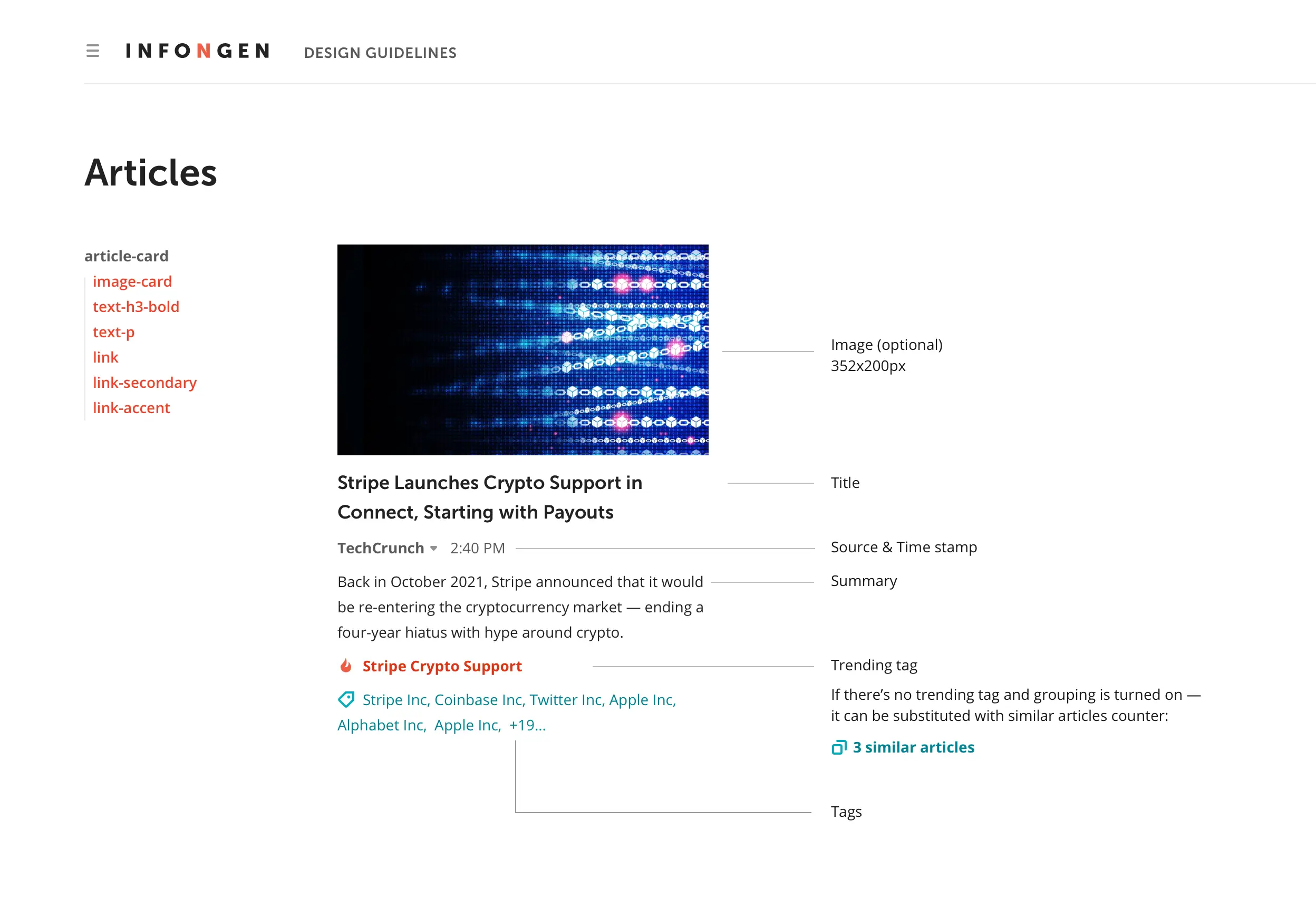
Design System
One of the goals we established initially was to make the product easily scalable in the future. To achieve that, my team and I created a design system.
We documented most of the components we used in our designs.
We collaborated with the development team to make elements (and hence the code) reusable
A clear set of rules and guidelines helps create new pages quickly and consistently with the overall style
Component description contains a list of other elements it has within
Usability Testing
While I’m sure we did a fantastic job, it was time to check if it was true or not. One of the most crucial steps in building anything is to test it with real people. Especially when you're doing changes as we did.
To prepare for the testing, I needed to answer three questions:
What is the goal of the testing? What am I trying to confirm or deny? I had a list of previously defined product goals and customer pain points that I tried to reduce. Setting up searches was the obvious scenario to test: it's the most crucial function of the product and the most challenging for our audience.
ICustomers understand the search results
Customers understand the search resultsWe will ask people to describe what they see and can do on the search results page
IICustomers can modify existing searches
Customers can modify existing searchesWe will ask them to edit a search based on a few pre-defined tags
IIICustomers can create new searches
Customers can create new searchesWe will invite people to start a new search assuming they are interested in a specific industry
IVCustomers understand the navigation
Customers understand the navigationWe will ask them to look for the new search and describe how they understand the navigation
Assumptions we tested
Who's going to do the test? Thankfully, finding who would like to try the new product was not a problem. The customer support team suggested many references that I could contact. Plus, many clients who participated in the research before were also willing to help. Best practices indicate that five people can help discover most of the issues. I recruited twelve indivuduals for the test—six for each customer profile.
Elena, a UX designer, on a call with a user during usability testing. Lunges were not part of the test.
How is the test will be conducted? I created a script and organized one-on-one sessions with the participants. They got to play with a prototype while I asked them to perform familiar tasks. Meanwhile, I observed their reactions and behavior and listened to their thoughts.
This approach helped me see how the solution works in the hands of real people and if the known problems got resolved. At the end of each session, I also asked participants to fill out a questionnaire about the old version of the product and the new one—to get a quantitative analysis of the redesign.
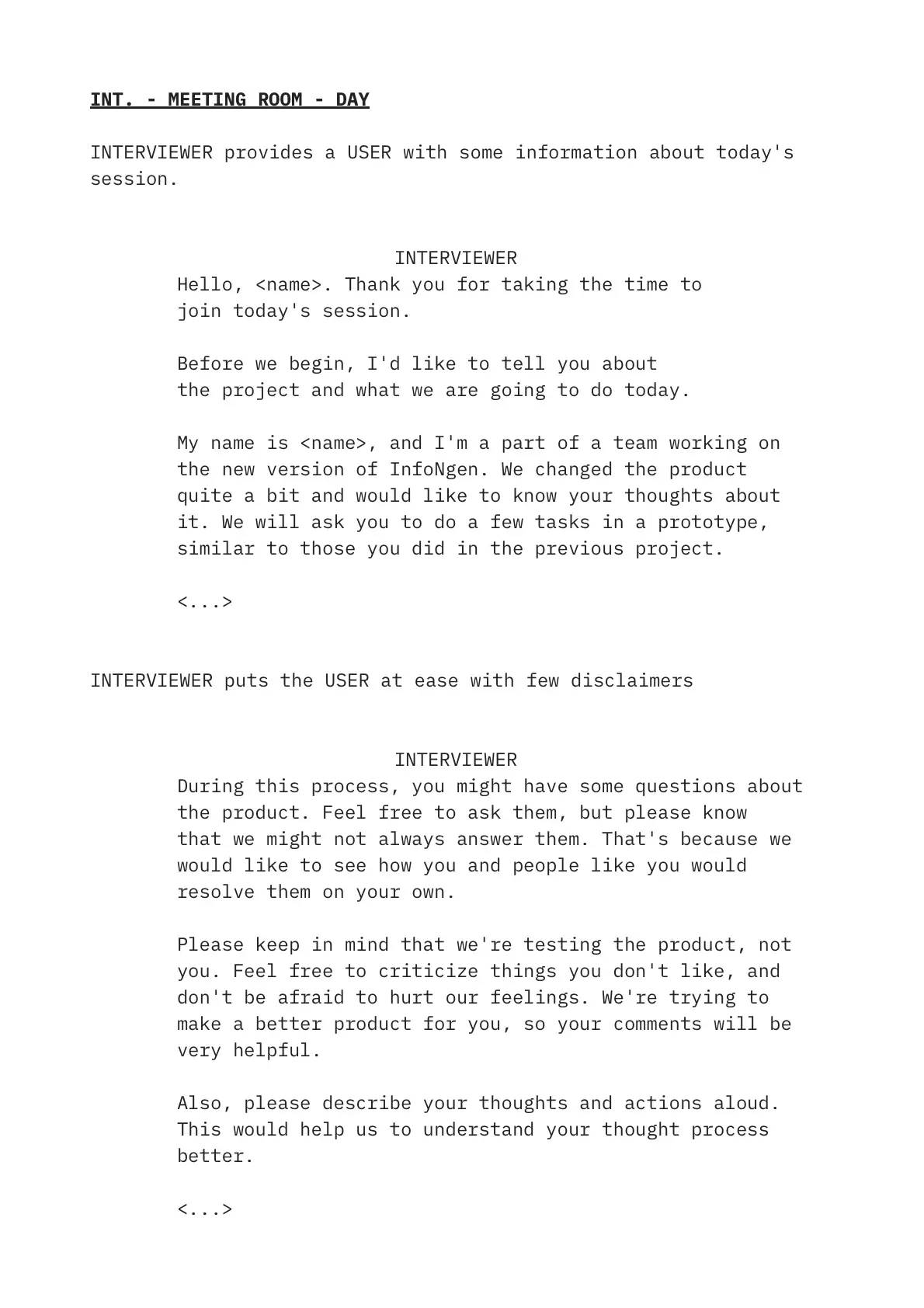
Results
We received overwhelmingly positive responses, which my team and I summarized in a spreadsheet. Most of the respondents successfully set up a search. They also completed other tasks, even after having trouble with them in the previous version.
Old Product vs New Design Prototype
Questionnaire results. More is better
However, we also heard mixed reactions about some of the new terminology. We also discovered a few other minor issues.
Testing a simple prototype allowed my team to quickly implement improvements into the design, before spending time and resources to make the whole product.
As I'm writing this, the product is still in development.
Lessons Learned
In my career, I didn't always have an opportunity to do a product "by the book." So it was great to enjoy the freedom and establish a proper process with research, team collaboration, usability testing, and more. I had a blast working with my team, and the challenges were interesting to solve.
Our design team
Stakeholders did not actively engage in the developmentThough the most demanding for me was collaborating with people outside the design-development team. Many stakeholders did not actively engage in the development of the product. As a result, they sometimes did not understand how specific solutions were made and objected to them. It led me to spend time and energy educating managers about the process and selling the solution to them instead of focusing on helping our customers. When decision-makers are unengaged, it's always harder to progress.
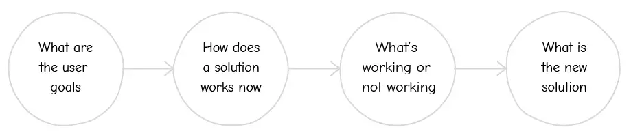
My team and I would often hear feedback in the form of a solution. Focusing on solutions instead of problems is relatively typical in the industry. So, to make discussions more productive, we created a framework for design review sessions:
My arguments or authority were not always enough
I always try to support my suggestions with customer feedback and the industry's best practices. Yet often, my voice wasn't heard. As a result, quite a few judgments were made based on subjective opinions. Sometimes, my ideas could be implemented only to be reverted after I left the project. Unfortunately, my arguments or authority were not always enough to push to the end.
The design process is relatively easy. Yet designers need to get more control over projects in their organizations and become advocates for the customers. And this is something I should do better in the future.