Behind the Brand of Postman's APIGTM Conference
In October 2025, Postman HQ in San Francisco hosted the APIGTM event. The theme was driving API growth in the AI era, and the event featured speakers from companies such as Google DeepMind, Salesforce, AWS, HubSpot, and Twilio.
I had an excellent opportunity to develop APIGTM branding.
Although my primary job is product design, I love doing everything creative. Often, with graphic design, you get to do much more fun things that simply won’t work in user interface design.
The deadline was quite tight: I had about three days to develop the baseline identity, allowing enough time to prepare all necessary materials
Logo
I started with a logo. My first instinct was to follow the existing identity of another Postman conference: POST/CON. Their branding is great, but I wanted to make something different: these conferences are unrelated, as APIGTM is focused solely on API publishers.
The central theme that the Postman brand follows is space. After all, our mascot is an astronaut doing astronaughty things. The conference theme is go-to-market. So the simplest parallel I decided to make here is: go to market → go to space.
For me, space travel is deeply connected with a feeling of nostalgia. I watched a ton of movies about space exploration and Apollo missions, and I read many sci-fi books as a kid.
So for the logo, I wanted to reference the coolest space logo I know: NASA, also known as The Worm. Specifically, the version of the logo that was used during the golden age of space exploration before the 1990s.
Digging further into the NASA theme, I started looking into their 1975 Graphics Standards Manual (casual read, I know). Their aesthetic is typical of the corporate modernism that dominated American institutional design in the 70s–80s: simple colors and shapes, the Helvetica typeface, and heavy use of photography.
Another great thing about NASA is that all their photos are available online in full resolution and are free for commercial use. Apollo mission archives are fantastic.
I found a few cool photos and began exploring how they could be used in APIGTM branding.
Take 1: Channeling NASA
The key elements I needed in most parts of the branding materials were the conference and Postman logos and the conference title.
This wasn’t it. While it did look NASA-ish, it didn’t feel like Postman. I didn’t want to copy Postman brand elements directly, yet I wanted it to feel familiar. And the Postman brand doesn’t use photography at all.
So, I looked into a different nostalgia.
Take 2: Galaxy Far Away
Star Wars movies were one of my favorites growing up. And they have an aesthetic that might just work. I’m referring specifically to many screens and interfaces throughout the movies.
This could feel more like Postman: simple elements and lines, dark theme, planets, etc.
I identified three key components that make the Star Wars interface feel: coordinate grids, planetary orbits, and schematics/topography.
Exploring Directions
Let’s see how they can work for the conference cover slide or primary graphic element.
In the first movie, the interface on the left was featured in the plot to destroy the Death Star. But the conference is about launching things, not destroying them—so I put a ramp.
Does the graphic feel sci-fi-ish? Yes. Does it feel space-y? Not really.
Next, I tried using a topographic map of San Francisco with the yellow dot pointing at the Postman HQ location. While topographic maps always look dope in these neon-blue colors, they are not really space-y.
Now we’re onto something. Orbits, planets, grids. Sci-fi and space feeling. The star in the middle represents the Postman API Network, which helps your API (the yellow line) slingshot into the market. Not really super-obvious, yet it doesn’t have to be. Branding should be about the vibes first.
Let’s iterate some more. You know, how interfaces in sci-fi movies have many knobs, bars, graphs, and metrics? I added graphical elements to make it resemble an interface. Then, I flipped the yellow arrow so it moved forward and upward, and referenced API response codes with the bars at the bottom.
The Branding
This became the baseline graphic for APIGTM:
Another important asset for the conference was a speaker card. Those were meant to be shared by the speakers on social media.
I added post-processing for photos for a couple of reasons: a) it looks cool, like a sci-fi hologram; b) it helps to have a consistent style for photos without the need for a special photoshoot.
And another key consideration: customizing assets for every speaker should be easy. With Figma Buzz, it’s simple: I uploaded a template and a spreadsheet with text (name, title, etc.), and Figma generated assets for every speaker. Though photos still needed to be added manually, automatic background removal was super helpful here. Highly recommend.
Dots represent speaker name initials in binary code.

A few other assets I created:
Finally, I designed a sticker that was inspired by NASA mission badges.
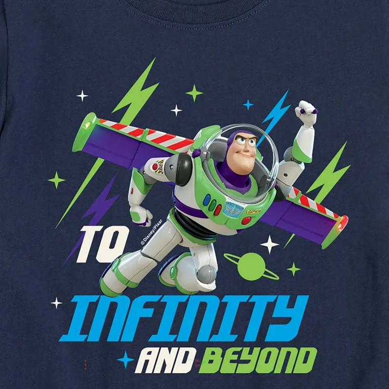
While I was working on it, the slogan “To infinity and beyond” randomly popped into my head. I thought it was from Star Trek at first, but it’s actually a catchphrase of Buzz Lightyear from the Toy Story films. It was the inspiration behind “To 200 OK and beyond” on the sticker.
Ok, now I need to rewatch Andor.